
In general Tabs are used to break up content into multiple sections within one screen to be able to save space on a page. Each section contains its own content e.g. forms. The switching between each tab is done by clicking on the tabs label.
Example File (Builder project Advanced Modeling/UI): UI.zip
<your example path>\Advanced Modeling\UI\uml\uiTabs.xml
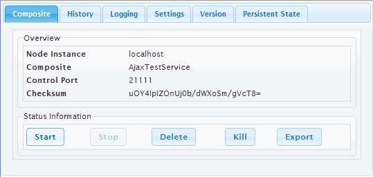
Tabbed Pane Widget Specifications
The actual Tabbed Pane element is needed as a main template organizing the single tabs and their order and position. It is later assigned to the <<UITabState>>.
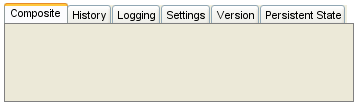
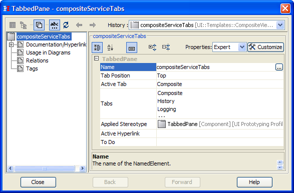
The way the tabs are organized is defined in the tabbed panes specifications.
|
Property |
Description |
|---|---|
|
Name |
Name of the Tabbed Pane container |
|
Active Tab |
Defines which tab is initially active when the page is loaded. |
Tabbed Pane Navigation
The tab navigation is defined in a Tabbed Pane Navigation (<<UITabState>>).
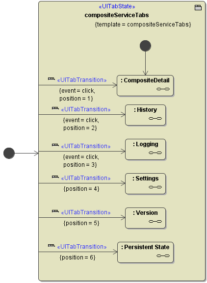
The xUML Compiler enforces some rules:
-
There must be exactly one start bubble within the <<UITabState>>
-
A <<UITabTransition>> can only have one target state.
-
The <<UITabState>> needs a template defined to be able to validate whether all positions could be found.
Usage of the UI Widgets: